So, an update on the kitchen. I last left you with an oh-so-tantalizing teaser about painting the newly-installed textured wallpaper. Mom and I worked hard on getting it painted before moving weekend, but that ended up learning me some lessons:
- The cheapest paint you can find is thin, drips a lot, and doesn't cover well. Which is, you know, why it's cheap.
- That wallpaper sucks up a lot of paint. You need more than you think you do.
- The right blue is really hard to choose. I was going for a lighter-toned gray/cadet/robin's egg blue, that wouldn't be too dark or overpowering and wouldn't look pastel. Then you have to worry about it looking too purple sometimes, or too green... Anyway.
- Our kitchen has about twelve light sources, and every one of them makes the color look different. (The overhead lights, the light over the sink, the range light, the window... not to mention the shadowy areas under the cabinets.) I found a color I was happy with in one area, that looked wrong in two others.
I was trying to be adventurous and use color and all that, but in the end, the color I'd spent so long choosing was all "It's a Boy!" powder-blue, which managed to make the taupe in the rooms on either side of it look pink. So we stepped back a bit, and in the wee hours of the morning the night before the new floor came and the move was to begin, we repainted it a safe cream.
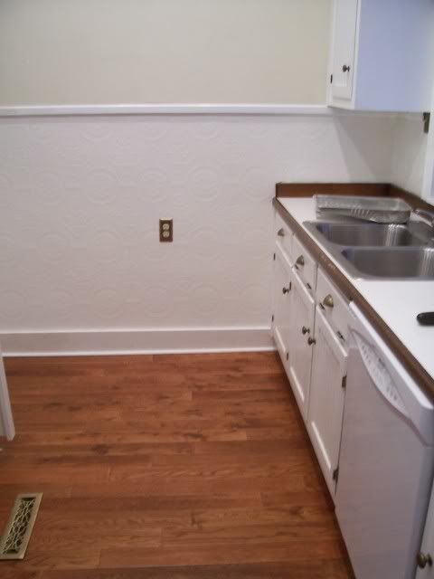
Here's a wall, against the new floor, RE-painted in Ralph Lauren, "Chalk White:"

I have very carefully not shown you pictures of the opposite cabinets. They're topped with, we think, handmade "butcher block" countertops (2x2s bolted together, apparently). They had a dark stain on them and a crazy-thick layer of shellac, which wasn't in too great shape.
I'll save the rest for a post with pictures, but they have undergone a magnificent transformation, thanks to the combined efforts of the Mr., my sister-in-law, and my father-in-law. The countertop that IS pictured is laminate with an edging that matched the old countertops; our hope is to replace
that whole thing with a stone or solid-surface top. That way, we get to keep the great wooden countertops, but we'll also have a harder-wearing surface. More to come!

what about me? the wall wouldn't have that just wagged on look without my help.
ReplyDelete-an angry captain
what's the deal with the security code? case sensitive is hard for dogs.
ReplyDeleteAh, the elusive perfect paint color; that is how our living room and dining room ended up, respectively, initially bearing coats of "flesh" and "baby poo." I feel your pain. The "chalk white" looks lovely, although I'm disappointed in Ralph Lauren -- where's the nomenclatural creativity? No "Hint of Caspar"? No "Melting Snowflake"?
ReplyDeleteLooks great--live and learn, huh?
ReplyDeleteCan't wait to see the countertops!
Mom
You've made the best choice in your paint. You cannot go wrong with chalk white. aunty
ReplyDelete